Adaptive layouts & fluid grids
Content reorganizes intelligently so users navigate easily on any device — no rigid resizing.

A potential customer lands from their phone. The text feels cramped, buttons are hard to tap, images don’t load correctly — and within seconds, they leave. Not because your business isn’t relevant, but because your website didn’t adapt. Traffic is there, interest exists, but the experience quietly breaks the opportunity.
Responsive Web Design ensures your site automatically adapts to any screen — without compromising usability, speed or clarity.
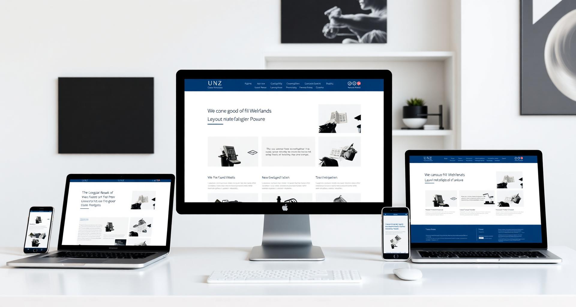
Responsive Web Design ensures your website automatically adapts to any screen — mobile, tablet or desktop — without compromising usability, speed or clarity. It’s not just about fitting content into smaller screens. It’s about preserving intent: making sure every visitor, regardless of device, experiences your business the way it was meant to be understood.
User behavior has changed permanently. People move between devices throughout the day, expecting consistency without friction. A website that fails to adapt creates doubt, and doubt costs conversions. Responsive design isn’t a visual upgrade — it’s a long-term decision that protects your traffic investment, supports SEO performance and keeps your business accessible in a multi-device world.
We start by understanding how your users actually interact with your website across devices, then structure layouts that fluidly respond to different screen sizes rather than forcing rigid designs to fit. Content is reorganized, not just resized — key messages stay clear whether someone is browsing quickly on a phone or exploring in depth on a desktop. Design and development work together on flexible grids, scalable images and adaptive elements, with continuous testing across devices before anything goes live.
Responsive design goes far beyond stacking elements. It involves fluid grid systems, breakpoint strategies, performance optimization and careful handling of media to avoid slow load times on mobile networks.
Every decision — from typography scaling to touch interactions — affects usability. A poorly implemented responsive site can feel just as broken as a non-responsive one.

/What you receive
A seamless experience across every screen your customers use.
Content reorganizes intelligently so users navigate easily on any device — no rigid resizing.
Speed and usability prioritized where most of your traffic actually happens today.
Scale without breaking design or slowing down load times — even on mobile networks.
Builds trust regardless of screen size or platform — the same intent, everywhere.
Supports rankings by meeting modern usability standards search engines actively reward.
A responsive website removes friction from the user journey. Visitors stay longer because the experience feels natural, not forced. Navigation becomes intuitive, content is easier to consume, and actions like filling out a form or making a purchase require less effort.
Over time, this translates into stronger engagement metrics, better conversion rates and improved search visibility — the same traffic starts producing better results, simply because the experience no longer pushes users away.
For businesses scaling across channels, responsive design protects every marketing investment — paid, organic and direct — by making the destination work on the device the visitor actually uses.

/WHAT OUR
“TheFactory helped us discover hidden issues that our internal team and previous agency completely missed. The audit was actionable and clear , we knew exactly what to do next.”
Alex G., Head of Marketing at a SaaS company
Andrei M.
Founder, Fintech
“The audit gave us a clear roadmap. Traffic up 40% in 4 months.”
Julia K.
CMO, E-commerce
“Found issues two agencies missed. Worth every euro.”
Sorin R.
Head of SEO
“Actionable, prioritized, no fluff. We knew where to start.”
Theo P.
CEO, B2B SaaS
“Finally an audit our dev team actually implemented.”
Laura N.
Marketing Lead
“Crystal-clear report and a great walkthrough session.”
Radu M.
Owner, Retail
“Local rankings doubled within 3 months of fixes.”
The process starts with an evaluation of the current site or requirements, followed by design adaptation for key screen sizes. Development brings those designs to life with flexible frameworks, after which thorough testing ensures everything performs consistently across devices — no rushed rollout.
Your current site or requirements are evaluated, then designs are adapted for the key screen sizes that matter to your audience.
Development brings the designs to life with fluid grids, scalable media and adaptive components engineered for real content.
Thorough QA on real devices and browsers ensures everything performs consistently before a stable, reliable rollout.
A responsive website works best when it reflects both your business goals and how your customers actually interact with you. If your current site feels like it’s underperforming, there’s usually a clear reason — and a practical way to fix it.
With over a decade in SEO, PPC and web development, TheFactory approaches responsive design as part of a larger performance system — not an isolated task. The goal is simple: a website that works reliably, converts consistently and grows with your business, without unnecessary risk.